Generally, in a recovering economy, all asset classes, such as commodities, stocks, and real estate would increase in value. The only exception is bonds because in good times, most investors will desert fixed income bonds in their search for greater returns from other asset classes. So the value of bonds can be a good indicator of the future state of the economy. As we all know, the value of bonds moves inversely with their yields, the higher the yields, the lower the value and vice versa.
With more than 200 years of recorded historical yields behind it, the 10-year US T-note would make a good choice as a predictor of the US economic fortunes. The graph below from The Economist charts the movements of both British and US bonds. To see the impact of the Kondratieff Waves (KW) on the bond yields, I've delineated the graph into four KW periods using 1780 as the starting point, and estimating each KW to span 60 years. There are no hard and fast rules regarding the periods, these are my ballpark estimates but so far in terms of explaining economic trends and events, they are pretty indicative of the start and end of each KW.
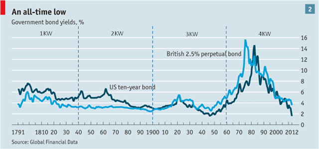
There's also another similar graph below from Goldman Sachs with annotations of key events and the yields when the events arose. It's very helpful as you'll notice that wars don't necessarily contribute to high interest rates. We've been brainwashed that the Vietnam war was a major cause of the high inflationary years, and by extension, the high interest rates, of the late 1970s and early 1980s. We can counter this specious argument with other wars, the US Civil war and the WWII, in which bond yields fell.

Our main concern, however, is to find out whether the T-note yields can provide a useful predictive pattern to how the future will unfold. If you go back to the first chart, you'll notice that in the first half of each wave, the yields would rise only to drop in the second half. Well, almost all except in the 3KW but this was an extraordinary event forced upon by the greatest war ever witnessed.
Ordinarily, we would assume that in the current 4KW, as bond yields have reached their trough since you can't go below zero, there's no other way than up. This is also in line with the economic recovery being felt in the US, bucking the trend in the rest of the world. Not so fast. There's still another option, that is, to meander sluggishly at the bottom. Take a look at the following chart from Bloomberg and you'll realise why the current state is under extreme pressure to snap.

Towards the second half of the 3KW, Hitler inflicted the biggest catastrophe on mankind. But in every tribulation, there's a blessing. The global economy grew at a rapid clip after WWII, especially from the early 1950s to the early 1960s precisely because Hitler handed a clean slate to the postwar generation. Both physical and financial wealth were wiped out. There was a lot of rebuilding to be carried out and the US was generous enough to grant aid, not loans, to Europe in the form of the US$13 billion Marshall Plan. That was on top of an earlier US$12 billion assistance. If you think that's small, both aid amounted to 10% of US GDP then. As for Japan, it rebuilt its industrial strength from the largesse of the 1950-1953 Korean war. Essentially, the growth came from the 3KW, not the 4KW, technologies.
The 4KW technologies, comprising the computers and internet, became widespread only from the early 1990s. Therefore, without WWII, growth would have been sluggish from the 1950s to the 1960s. Likewise, the likelihood of a great wealth destruction under the current circumstances is very slim. The 5KW technological drivers, biotechnology and nanotechnology, are still in their infancy. The current renewable energy initiatives, e.g., electric cars, photovoltaic solar panels, and wind turbines, do not incorporate 5KW technologies. So their incremental technological progress is limited; the substantial cost reduction seen in PV panels is largely through manufacturing economies of scale and brutal price slashing, a result of massive overcapacity.
So economic growth will certainly be elusive. The stack of charts below from The Financial Times illustrate that the returns of both bonds and equities are predicted to be low. For bonds, as the yields are rock bottom, their prices can't go any higher. As regards equities, their price/earning (P/E) ratios are extremely high (see bar number 9 in the bottom left panel chart) relative to the historical norm of the years from 1926 to 2012. Equity prices are also driven by business expectation of a recovering economy. In the US, this has been reflected by three successive monthly increases in the orders for capital goods. However for the whole world, Standard and Poors has warned of a 5.4% deep contraction in private capital investment in 2014. It's unlikely that the US can detach itself from the malaise besetting the whole world. So between equities and bonds, equities are the more likely to cede ground and snap from their current stratospheric prices.

Still, aside from the increasing private investment, we need to explain why equities for now have been moving in the wrong direction. There are two plausible explanations. First, as explained in my earlier post, Seize money before money seizes up, the corporations have been issuing corporate bonds to buy their own shares, pushing equity prices up in the process. It's a classic Ponzi scheme. You've got to keep on buying to keep prices up, all the while borrowing to finance the buying.
 The second is that in many countries wealth destruction is finally catching up on financial wealth. So money is fleeing these countries and flocking to the US in search of a safe haven. I don't have any data to support this contention but as seen on The Economist chart at left, the value of many emerging market currencies have dropped precipitously, suggesting money has fled from these countries. Its destination is surely the US as it appears to be the last refuge in a financially collapsing world. But the wealth holders fail to realise that the threat is not the declining growth in the rest of the world. The 4KW is in its twilight years, it's in its dying stage. It's like a dying man trying to escape death. There's no external threat, it's all within. The economic hardships plaguing the others will soon come to haunt the US. By then, there's no escaping the wealth destruction; if you don't destruct wealth, it'll self destruct.
No comments:
Post a Comment